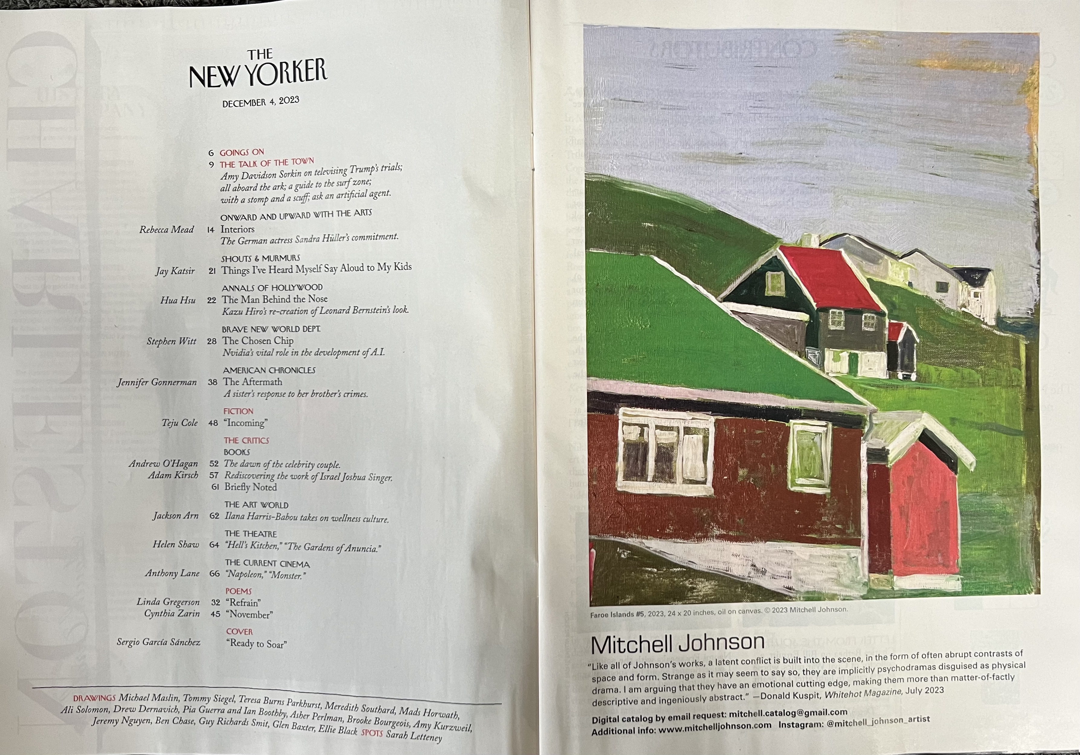
Seeing Paintings Instead of Locations
By Susana Byers
Published July 1997 in American Artist Magazine
For Mitchell Johnson, painting outdoors in a variety of environments is a demanding but often rewarding way to create a body of work and improve his skills. The artist began painting outside while studying with Paul Resika and Leland Bell at Parsons School of Design in New York City, where he earned his M.F.A. degree in 1990. "We took landscape-painting trips to western New Jersey, and I clearly remember being completely discouraged by the fleeting nature of the light," he recalls.
"Painting outdoors forced me to work faster and more efficiently, and I felt challenged by the urgency of seizing an ephemeral moment. It's something you just don't experience in a studio.”
He was also overwhelmed by the landscape itself. He says it took him a while to learn to see pantings instead of locations. "Don't make your painting about what you think a place looks like," he advises. "Make it
about the forms you have never seen before and have immediately fallen in love with.” Resika always said. 'Don't paint what you don't love.'
In arranging a composition, Johnson usually fixes on one element in the scene that intrigues him, such as a field, a tree, or a house, and builds the painting around it. Then, peering through a frame he makes with his fingers, he finds the lights and darks and tries to imagine how they will play against patches of middle-value color. After that, using large, disposable house-painting brushes, he begins his picture by establishing what he calls a "big light"-a value foundation made up of two or three major fields of color. He then switches to bristle brushes and tiny sables to work out the details, whether a cypress tree or a sharp streak of light.
"Every element in a painting must work in terms of composition and color," Johnson says. "My somewhat abstract interpretations of the landscape and people in outdoor scenes are the result of this belief; the painting has to function as a painting. For instance, when I depict a tree against a sky, there has to be both value and color tension between the two elements. I focus on color, texture, and placement as much as image. If one of these aspects, even in a single tree, doesn’t work, I’ll scrape off the paint and start over again-just as quickly as if the entire view had failed to come together.”
The abstract underpinning of Johnson’s work is noticeable in his use of color. A bright orange streak across a cloud-dotted blue sky or a glowing speck of white at the base of a dark forest calls attention to itself in a startling manner yet also brings viewers’ eyes into the composition as a whole. Johnson’s color treatment expands the effect of his paintings, giving them a depth that goes beyond ordinary realism.
The artist works on rough, absorbent, single-primed linen canvas with a range of brushes and uses both store-bought and homemade oil paints. He prefers linseed oil for a medium rather than turpentine because, he says, it produces a tough, durable surface for the paint instead of drying flat with little adhesion strength. He paints on location with a French easel and uses small palette knives to blend his paints. “When I’m tired from working in the sun, I’ll take a break in a shady spot, where I’ll mix dozens of colors,” he say. “By mixing paints on-site, I can get more accurate hues.”
Johnson is passionate about painting en-plein-air because he believes it forces him to grow as a painter. “Every time I paint outside, I learn something new-especially about color and value,” he says. My paintings improved substantially when I realized that even though the color looked right on my palette, it would not necessarily sit right on the canvas. Color is always a function of its relationship to other colors. I remember when I first painted in Tuscany in Italy, the yellow wheat fields drove me crazy because the yellow paint always looked too dark against the white canvas. But once I placed other colors alongside the yellow, I was able to tune its value to what I was seeing.
Johnson adds that he finds the constantly changing light very exciting. “Often, while painting a landscape, he notes, “a different light passes over the scene and I see something more interesting than what had enticed me to paint it in the first place. I then find myself altering the entire canvas to capture the change." Since the artist travels extensively looking for special light and color effects, he won't hesitate to completely rework a painting if
the unexpected occurs.
Johnson took his first painting trip to France--to a small town in Provence -while still a student at Parsons. He was struck by the light and scenery there, but when he began painting, he quickly became frustrated because he was unable to capture the colors. "The local people who saw my early work criticized me for making the paintings too dark and pointed out that I wasn't catching the sharp, southern light," he recalls.
Determined to paint the landscape, Johnson spent long, exhausting days in the sun on that trip and returned the following year, when he began to feel comfortable depicting the area. "I was finally able to let go and allow the place to teach me to paint it," he explains. "The weather, the richness of the terrain, and even my interactions with the people all affected what I was creating. I think the more familiar I became with the place, the freer I was to express myself.”
Ever since those first trips to France, Johnson has continued to travel and paint generally, for three to six months a year. In addition to an annual excursion to Provence, he also spends considerable time in Tuscany and New Mexico. “I've grown to prefer dry, sun-drenched landscapes, and these three regions provide that, each with its own subtleties," he explains.
"It's amazing that I could be driving in New Mexico and come upon a field that is the same gray color I remember from Tuscany. Or I can go home to Palo Alto and see the type of sky I saw in Provence. Some times by looking at a scene near my home, I'm able to complete a painting I started in Italy or France.”
Because he generally paints in the same locations while traveling abroad, Johnson stores easels and paints in each country to reduce the amount of equipment he must transport. All he comes home with are the paintings, which have been removed from their stretchers and are re-stretched later. Johnson suggests to anyone who wants to paint outdoors away from home to put together a list of the equipment and materials needed to make sure nothing is forgotten and to practice setting up outside as a double check. He also advises, “Don’t forget to bring a good hat and sunblock, keep your painting in the shade while you’re working on it so that it will look good in any light, and bring along a canvas bag you can fill with rocks or water bottles to ballast your easel.”
The son of an army chaplain, Johnson became adjusted to traveling at an early age because his father had to relocate often. He also enjoys it. “When I move around, certain unexpected situations or problems arise that add to the creative experience,” he says. “I don’t fall into a routine the way I do when I’m at home, and each day becomes more profound. My paintings are born of uncertainty and adventure. The ones I do of Tuscany, for instance, are as much about what is happening to me at the time as about the province’s yellow hills.”
Johnson, who holds a B.S. degree from Randolph-Macon College in Ashland, Virginia, and an M.F.A from Parsons School of Design in New York City, is represented by Hackett-Freedman in San Francisco, Tatistcheff/Rogers in Santa Monica, California, Robischon Gallery in Denver and Mitchell, Brown Fine Art in Santa Fe.
Susana Byers is a freelance writer and producer in the film and television industries. She lives in New York City.


%20on%20the%20back%20cover%20of%20May%2026,%202025%20New%20Yorker%20Magazine.png)